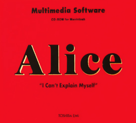
Synergy is a rather unique publisher in the history of computer games. During the first half of the ’90s, this Japanese company put considerable effort into publishing – and even localizing – a small number of experimental adventure games which were some of the first games released in the then state-of-the-art CD-ROM format. Synergy ended up fading into History after it went bankrupt around 1997, yet they managed to develop sort of a cult following – mainly thanks to their publishing of Gadget, a dark sci-fi interactive story created by game designer and 3D artist Haruhiko Shono. It wasn’t his first work though and his debut, an oddball called Alice: An Interactive Museum, was actually published back in 1991.
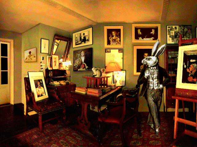
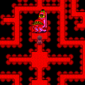
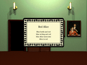
As the title implies, the game is based off Lewis Carroll’s timeless classic – well, very loosely. It’s a free-form interpretation, to say the least… When the game begins, you find yourself in what appears to be a huge lobby, with the sound of tuning instruments resonating through its black-and-white architecture. After sighting a bunch of paintings, you are teleported to an unrelated entry hall, in front of a door from which resonates a clearly festive ambiance. However, opening it only reveals an empty room… Empty, safe for a tiny puddle on the ground formed by a leaking roof. On closer inspection, it is revealed that this wet spot is capable of summoning a cupboard containing a book that serves as a portal to yet another world. That’s how you finally end up in a messy but classy lounge, where the White Rabbit himself invites you to follow him.
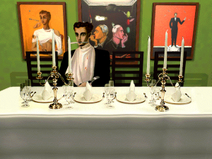
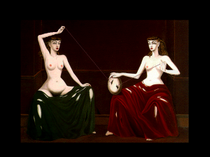
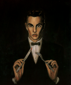
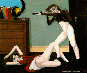
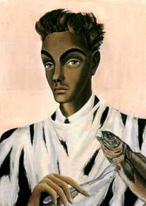
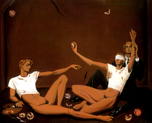
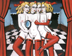
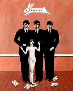
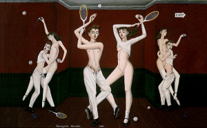
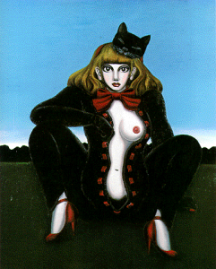
The destination isn’t Wonderland, though, and what you end up in are apartments devoid of human life yet decorated as if someone was still living there. There are paintings everywhere – but they aren’t just anybody’s paintings. They were made by an actual real-world artist, Kuniyoshi Kaneko – because Alice is above all a collaborative work.
Kuniyoshi Kaneko is a Japanese painter and artist, born in 1936 in the Saitama prefecture and still working to this day. He developed an interest in the Arts in general at an early age, and he even secretely attended ballet lessons at 15 after being left in awe by a Sonia Arova performance. During his studies at the College of Arts of the prestigious Nihon University he joined at age 19, he took a specfic liking to two very different aesthetic conceptions: Japanese traditional arts such as kabuki theatre on one hand, and modern Western conception of mode and design on the other. Quite an heteroclit imagination indeed… From this spawned a succesful carrer during which he produced – and still does – an impressive quantity of paintings as well as countless series of drawings and other visual creations. He even did the illustrations for some of French thinker Georges Bataille‘s most renowed novels, such as L’Histoire de Œil. Actually, one could say he has a bit of notoriety, at least in his native country: he was even commissioned to design the covers of… Japanese republications of Shakespearean classics.
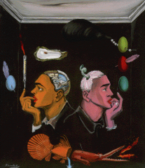
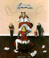
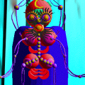
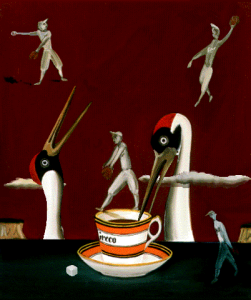
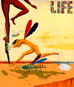
The least that could be said about his style is that it is… unique. Using the “Surrealist” adjective in its original meaning isn’t a stretch when talking about his creations, as they really do find themselves in the line of such painters as Salvador Dalì, Paul Delvaux, René Magritte or Leonor Fini. But what truly sets Kaneko apart is how he infused this with the erotica of ’50s American pin-ups in the style of early Playboy, and a love for ridiculously grotesque situations that recalls the ero-guro avant-garde of Taishou-era Tokyo. Quite a bizarre and improbable mix, indeed. And his style only gets more haunting as its audience starts to get accustomed to its recurrent motifs – androgynous models, fair skins, unzipped trousers, small bloodstains, fishes, forks, the list goes on. There is not doubt about it: Kaneko’s painting are born from a very special mind.
Shono’s idea was to let the player discover the artist’s world through an interactive experience in the style of a first-person adventure game. Which was quite a challenge, especially in a time where complex visuals were not something just any studio could pull off yet, since the CD-ROM standard was merely in its early years. It was clearly a pioneering project – maybe a bit too much, actually. However, there is no denying the effort that went into the art direction.
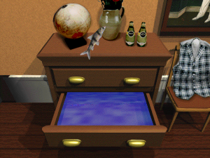
The choice of using realistic CGs made from actual photographs was rather daring. It works surprisingly well, though, even to this day. Actually, it was even a pretty smart move: the photorealistic backgrounds offer a powerful contrast with what’s actually going on around. Indeed, Kaneko’s craziness seems to have leaked from the paintings and infiltrated the game’s environment as a whole – do not be surprised if you find a pond in which splashes a fish when opening a drawer or if you reverse the room’s gravity by simply checking a top hat.
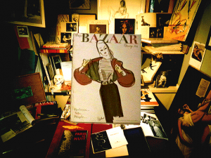
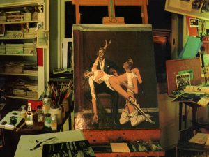
The walls of these mysterious rooms are covered in paintings, but it actually looks less like an art gallery than Kaneko’s very own workshop – actually, some of the photographs used as a source for the visuals are from his real-world studio. Some of the material that served as an inspiration for Alice can even be found lying around, including vintage Vogue or Bazaar magazines, and it’s quite funny to see so many references to French artists or intellectuals in an obscure Japanese game. It does a very good job of connecting the player with Kaneko’s mind – as psychologically dangerous this concept might sound.
So, since Shono wanted to bring these painting to life, most of them are interactive – whether it’s just a senseless gimmick or a bizarre riddle to solve. The idea was pretty interesting: Creating puzzles from surrealist paintings was indeed kind of a novelty. After all, it even goes against one of game design’s golden rule: the notion that form should follow function. In Alice, it’s the complete opposite: they had some weird artworks Kaneko came up with to work with as a form, and had to come up with a function for them. And while there a few good finds, it also ends up being the game’s shortcoming: its execution is way too weak.
The thing is there aren’t that many interactive paintings in the end when compared to the overall obstacle course you’ll have to go through. The goal isn’t anything obscure though: you simply have to get your hands on a deck of fifty-three playing cards by uncovering them in the game’s environment – each card containing an hint to help you solve the game’s riddles. However, Alice is a pre-Myst first-person adventure game… and it shows.
First of all, there is no way of keeping track of the cards you found and no save system whatsoever – that doesn’t help. Besides, simply moving around is a slow and clumsy process, and making your way through the apartments can quickly get irritating. But the real issue here is how obtuse the puzzles can get… Note that the problem isn’t that they are twisted, though – that would be their distinctive quality – but because most of it is just anti-ergonomic. Prepare yourself for all of the genre’s shortcomings, from pixel hunt to “one-click-too-much” cancellations. There is one specific room where this lack of consideration for the player’s patience is seriously obvious.
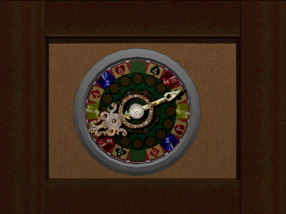
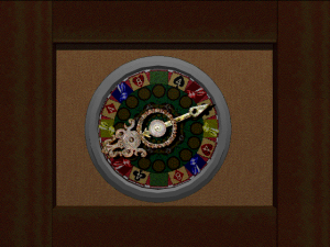
That one room happens to be a casino. You can already guess what’s gonna wrong here. So… there are slot machines, a poker table and a bunch of kinescopes – which all require differently-colored tokens to work. These tokens are obtained at a nearby spinning wheel which gives you one random token at a time. And with that… you need to obtain a 777 at the slot machines, get two wins at the poker table and a take a look in the right kinescope which is randomly-generated. And since you’ll obviously fail pretty often at whatever you’re doing, you have to keep doing the same stupid stuff over and over again… It’s not over though: do note that it is perfectly possible and even likely that the wheel might not give you any token at all if you land on an… “unfriendly” spot, in which case it will actually teleport you to a completely random room. Yeah, right – you get the picture.
This bit alone makes the adventure a hassle to complete, and is symbolic of how obtuse the game can get. It’s a pitty, because a lot of work went into the art direction, and the concept had a lot of potential. Is it possible Alice might simply have been too ambitious for its time? It’s still worth a try in spite of its broken mechanics though, be it only for the journey through Kaneko’s artistic mind as Shono brought into interactive form.
