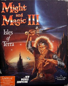
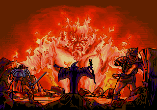
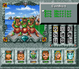
Might and Magic III brought a lot of changes to the series formula. First off, it’s distinctly more narrative focused than the earlier games; it opens with a fully voiced sequence where your party is taunted by a mysterious figure, Sheltem, the barely-fleshed-out villain of the first two games, who is still knocking around. Although it’s still possible to create new characters, the game is also the first in the series to start the player off with a pre-generated party, lead by the noble Paladin Sir Caneghem (named after the head designer of the game). This is also the first game in the series outside of the Macintosh versions of the games to support playing using a mouse.
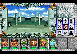
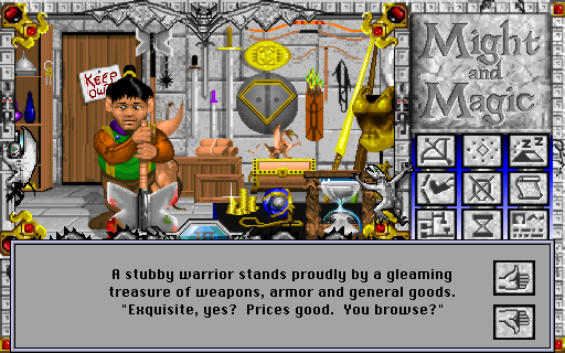
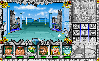
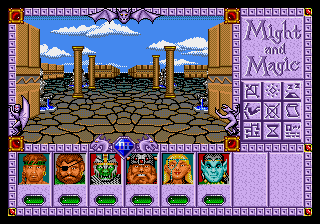
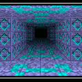
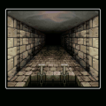
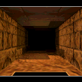
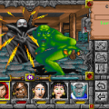
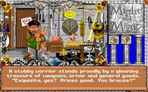
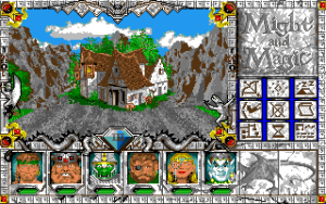
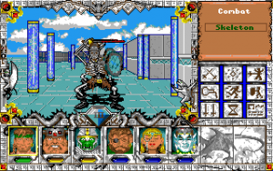
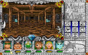
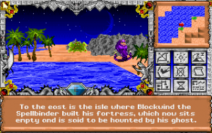
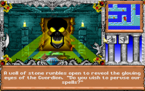
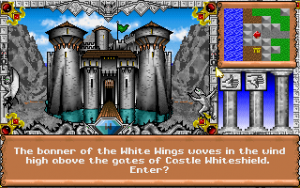
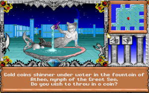
From a gameplay standpoint, there are several major improvements. This is the first PC game in the series to include an automap from the very beginning, as well as a quest log, and to lift the hard inventory limit. The graphics have also greatly improved, for the first time using animations for details like fountains and monsters, and the heroes are represented through character portraits.
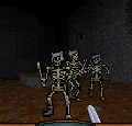
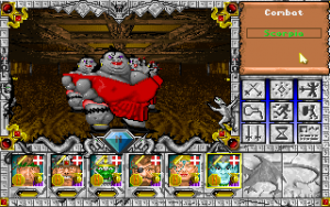
The fast-paced combat of Dungeon Master had left its trace on Might and Magic, and you can now see monsters approach from a distance, allowing ranged characters like rangers and mages to exchange fire as they approach. Additionally, monsters in dungeons and cities do not respawn automatically when you leave a dungeon, as they did in earlier games, though there are still wandering monster encounters in overworld areas. Instead, the player’s party can find the “camp” for the monsters on the map and destroy it. Destroying the monster’s camp prevents new monsters from being spawned in an area, and allowing the player to backtrack more easily.
However, Isles of Terra introduces some new flaws as well. While you can create your own characters instead of using pre-gens, you can only use character portraits which are not currently in use, leaving you with two possible characters of each race – if you delete the entire pre-generated party. Also, the interface has become heavily obfuscated. No information is given in the manual or the game to show which icons do what on the screen, leaving the player to have to quickly figure it out through trial and error. Some shortcuts (the tent with Zs coming out of it being “camp” are obvious, others, like the party screen, are a little more opaque (the icon looks like it should be for the options screen). The actual options screen is accessed by clicking on the gem with the roman numeral III below the 3D window.
While several of the old keyboard shortcuts are still the same (“I” for Inventory, for example), no information is given in the manual with regards to these as well. Instead, the manual is primarily taken up with an in-universe piece of fiction providing a basic explanation of the various races and character classes, without any actual mechanical explanation of what bonuses or weaknesses they have.
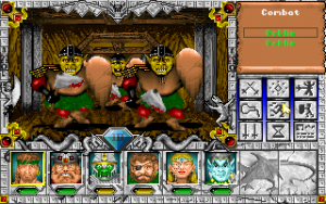
Dice rolls are no longer transparent, so you don’t know how much damage you’re dealing, or precisely how much damage your heroes are taking without looking at a character sheet. Character portraits and monster names are color coded to give the player a general idea at how well they’re doing, but it would be much more useful to tell precisely how hard a monster is hitting you, and to tell whether you’re simply not doing any damage to a monster early on (and whether you’re successfully playing off of any elemental weaknesses) in a fight, instead of forcing you to stick around to experiment and possibly get clobbered in the process.
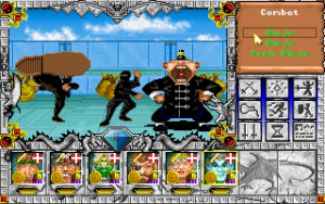
Also, the first two games in the series allowed set up party formations for front and back ranks in combat, with the tougher, more heavily armed fighters in the front, and squishy magic users and ranged attackers in the rear. Might and Magic III does away with this and places all of the party members on a single plane, leaving the party’s clerics and magic open to be regularly killed early on.
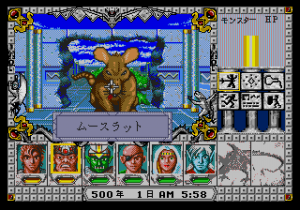
There is a certain style of Game Mastering with tabletop RPGs, which focuses primarily on immersion, where the GM handles all die-rolling and some stat tracking, particularly in combat, and it this concept may have been what the design team was shooting for. However, this style of play is rather rare, for the same reasons why it doesn’t quite work out here – it limits the amount of information players have available to make informed decisions, like “Can we take this Moose Rat or not?”, unless a clever GM substitutes accordingly.
The game also has some balance problems. Early on the heroes will find themselves facing large numbers of the aforementioned Moose Rats, which are, basically, rats the size of a moose, and which have a lot of hit points and deal a substantial amount of damage. Two moose rats can very easily give a starting party a run for their money. By comparison, in first and second edition D&D giant rats were only a threat when they occured in massive numbers and otherwise easy to kill. (D&D later got the Dire Rat in 3rd and 4th edition, which about matches the Moose Rat in Isles of Terra). The Storehouse in the first town in particular contains at least five moose rats, which will easily take out a freshly employed party. This problem may be related to the fact that the game appears to be balanced for the pre-generated party. When using them, most of the balance problems tend to go away. Moose Rats go down more quickly, with the party taking less damage. With a user created party, these fights were much tougher.
Nonetheless Might and Magic 3 is a vast improvement over earlier games in the series, and much more user friendly for new players.
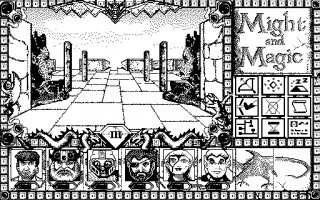
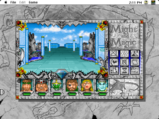
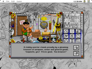
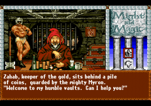
With its third iteration, the Might and Magic series left behind 8-bit systems, the original platform was the IBM PC. The optical differences between computer ports are very marginal, only the Macintosh now uses upscaled and filtered hi-res versions of the originals, although it also still supports black&white mode (in a rather lazy transfer).
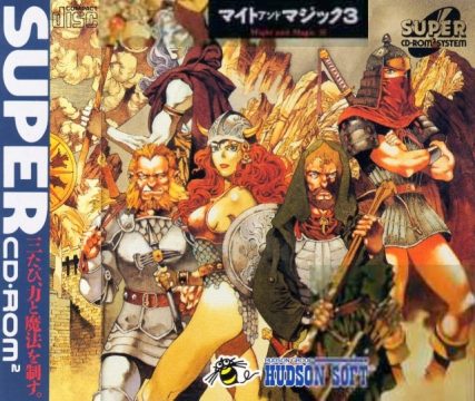
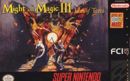
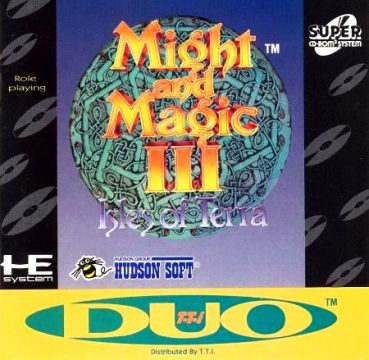
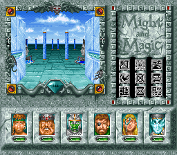
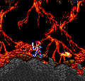
Isles of Terra is also the game with the most console ports, as the game is available for SNES, Sega CD and Turbografx CD, and a cancelled (but leaked) ROM-based Genesis beta. The Genesis and SNES versions are more or less the same as on the PC, with few differences besides the lack of mouse support on the Genesis. The colors are also more muted in the Genesis version, with the interface skewing more towards reddish tones, and with smaller sprites for some animated objects. The SNES version has mouse support and its graphics are closer to those on PC, with the exception of the monster sprites. However, it doesn’t have the digitized voice samples.
The CD based ports of course retain them, and add redbook audio, as usual. The Sega CD version was released only in Japan, thus all the hero portraits are redrawn in a manga-ish style, to appeal to a Japanese taste. The 3D graphics are simply downsampled from the original and rely heavily on dithering, which makes them look rather bad on today’s crystal-clear monitors.
The controls for all consoles, unless the player is using the SNES Mouse, are significantly more cumbersome than on PC. Accessing menus is considerably more difficult and response times feel sluggish. It doesn’t help that they all closely replicate the PC version’s interface, instead of adapting it to something more joypad-friendly as the earlier games did. While the console versions had been somewhat superior to the PC versions before, with this installment, the balance shifted in favor of the PC.
