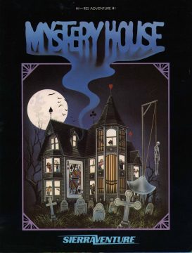
Based very loosely on Agatha Christie’s novel Ten Little Indians (also known as And Then There Were None), you play an unnamed character locked in a mansion with seven other guests. With a vague note telling of jewels hidden within the house walls, you soon find the other characters scattered around, all quite dead. A killer is on the loose, and you need to find the treasure, uncover the skeleton key to unlock the front door, and escape with your life.
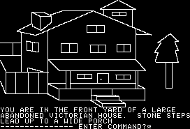
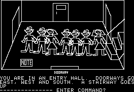
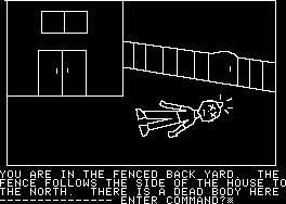
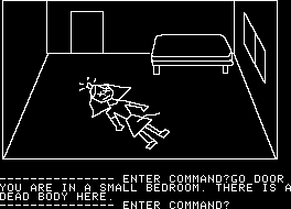
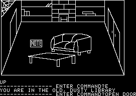
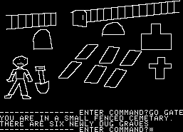
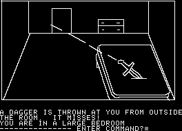
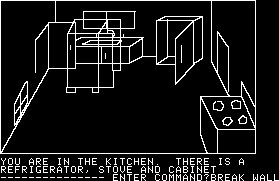
One of the most important adventure games ever made, Mystery House was the first in the genre to add graphics, whereas all previous games were entirely text-based. The visuals are, of course, quite rudimentary, consisting of shakily drawn white lines against a black background. The characters look as if they were lifted from a first grader’s notebook, and even minor items like knives and shovels are crudely drawn. It’s all understandable given the game’s age; it had to fit in the limited RAM of the Apple II, and since there were no real drawing programs on the market, Ken and Roberta Williams had to assemble their own device, combining a graphics tablet with a mechanical arm.
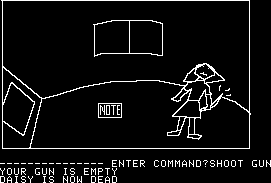
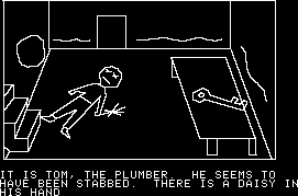
While Mystery House was a true pioneer amongst text adventures, its puzzles, story, writing – pretty much everything, actually – are all quite amateur. There’s not really much in the way of prose so much as stark descriptions. (“You are in the kitchen.”) All of the characters have professions, but none have any personality, nor any real purpose beyond popping up dead. If you pay attention to their bodies you can piece together some clues that implicate the murderer – one was strangled by pantyhose so the killer is probably a girl, and another is holding a daisy, which… well, spells out the killer’s name right there. You can easily kill yourself through stupid means – such as lighting a candle, tripping, setting the house on fire, and not putting it out in time – plus you can get lost in the surrounding forest. And there’s a short time limit at the beginning, where you need to find a light source lest you find yourself wandering in the dark.
And this is to say nothing of the extremely simple text parser, which only understands two word sentences. Right at the beginning, once you open the door to the house, you can’t just type “enter” or “go in” or even type the direction. The game only understands “go door”. It gets more confusing because the visuals don’t necessarily match up to the directions. For example, in one room, the door is on the right side of the screen, so it’s natural to assume that it’s to the east, but it’s actually to the south.
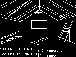
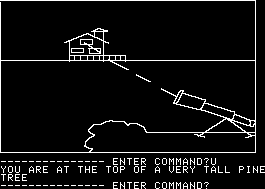
At least the house has several interesting secrets. The manor itself is relatively small, but there are a number of secret passageways, hidden compartments, and underground tunnels that fulfill its promise of being a “mystery house”. Still, one of the major puzzles really makes no sense – you need to figure out how to get into the trapdoor in the attic, which only magically becomes visible (and therefore accessible) after you’ve looked at it through a telescope, which is perched atop a tree in the middle of the forest.
Most of these quirks are outlined in the instruction pages before you begin, so at least it sets down its grammar rules and inconsistencies from the beginning. But it’s still a pain to play, and there’s little of interest to be found here beyond its historical value. In 1987, Sierra released the game into the public domain. It can be found on the Roberta Williams Anthology, along with the rest of Sierra’s High-Res Adventures, although they need to be run through an Apple II emulator. The game was also ported to the iOS by a company completely unrelated to Sierra.
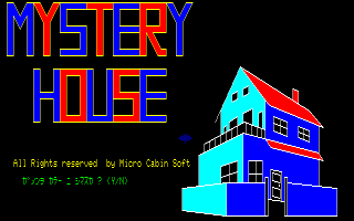
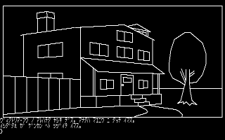
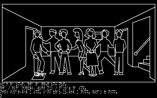
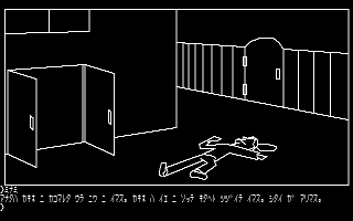
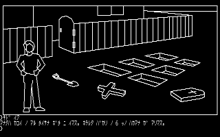
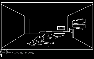
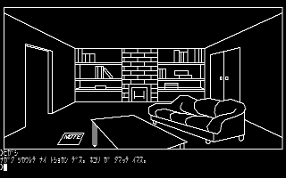
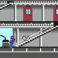
In 1983, a Japanese company called Starcraft ported Mystery House to Japanese computers such as the PC-6001. (There’s another graphic text adventure developed by Microcabin using the same name, although it’s entirely unrelated to Sierra’s game. This means there were two games on the market with the same title – one a shoddy ripoff, the other quite authentic.) While Starcraft’s port is very similar to the original Apple II version, all of the graphics have been redrawn and improved. It still uses the simplistic black and white line drawings, but all of the characters now have vaguely realistic proportions, despite not having any faces, and the visuals look far less rough. Part of this may have had to do with better technology, but the Japanese PCs also ran at a higher resolution than the Apple II, allowing for more screen real estate.
The redone visuals look really nice in comparison. The fact that everyone has blank faces looks really creepy, and the dead bodies are much more dramatically posed, with blood pouring out of them (or, rather, something that looks like blood – it’s still black and white) rather than the Looney Tunes-style lumps in the original one. Minor details have been added to the environment, like the windows in the upstairs floor being boarded up, further establishing the fact that you can’t escape. It’s obviously difficult to play if you don’t know Japanese, but it’s cool to compare the graphics.

